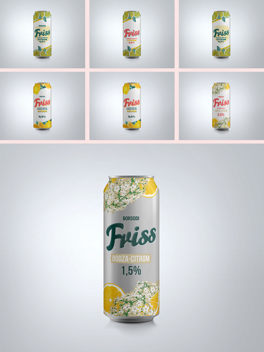

Testing the packaging versions showed us that there are some customary elements worth holding onto to aid the identifiability of the radler segment (which made our job easier and more difficult at the same time), and we also had to take into consideration the recognisability of the brand.
Road to the final version
When designing the different versions, we kept in mind the goals defined during the brand strategy development process: appealing to the younger target group with a sleeker, modern visual world that suggests quality, and, very importantly, strongly differentiating the alcoholic and the non-alcoholic products (which gained legal significance later when developing the TVC).
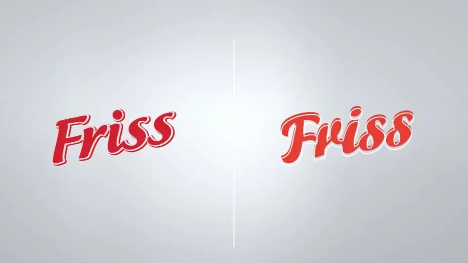
It was a real challenge to find a direction in this segment that is gender-neutral and exciting, but is still in keeping with the characteristic, fairly set graphic style of radlers (exploding fruits, icy water, etc.) It would also have been inadvisable to completely let go of the existing elements of the packaging (such as the Friss logo using a hand-written font).
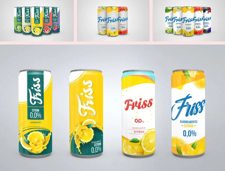
Among the first-round versions, there were some quite daring ones, radically distinct from the competitors’ packagings, some others that tried to break free of the conventional elements of the segment, and of course, the perfect happy medium (4 – this one ended up being the winner, as this was the direction that accomplished most of the goals we set, and it also performed the best in testing).
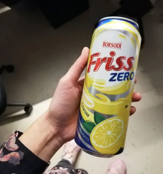
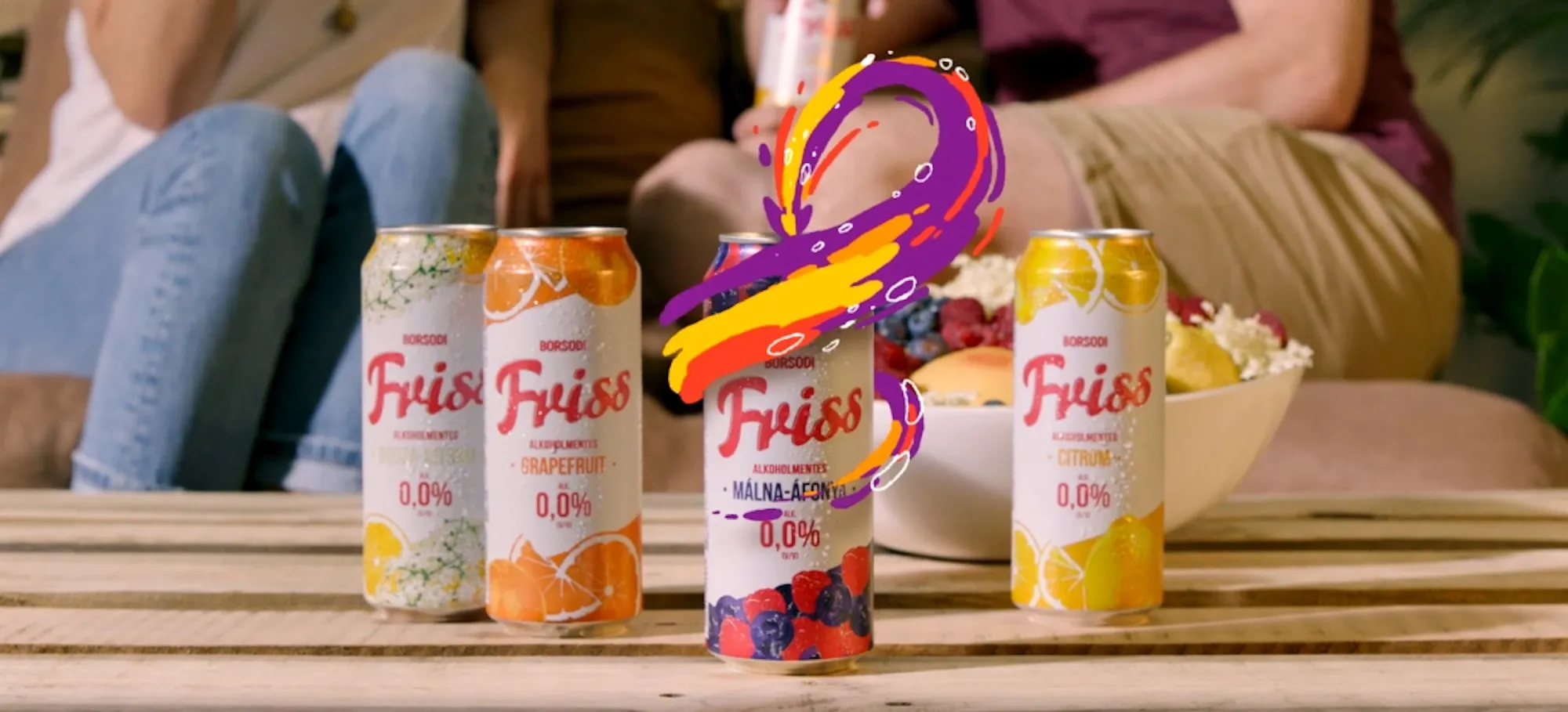
The next step was to fine-tune the selected packaging. Here our most important guideline was to ensure the identifiability of the brand and the segment, and to strongly differentiate the alcoholic and non-alcoholic versions. We created some designs with stylized illustrations of fruits, but in the end we agreed on a more photorealistic depiction with the client.